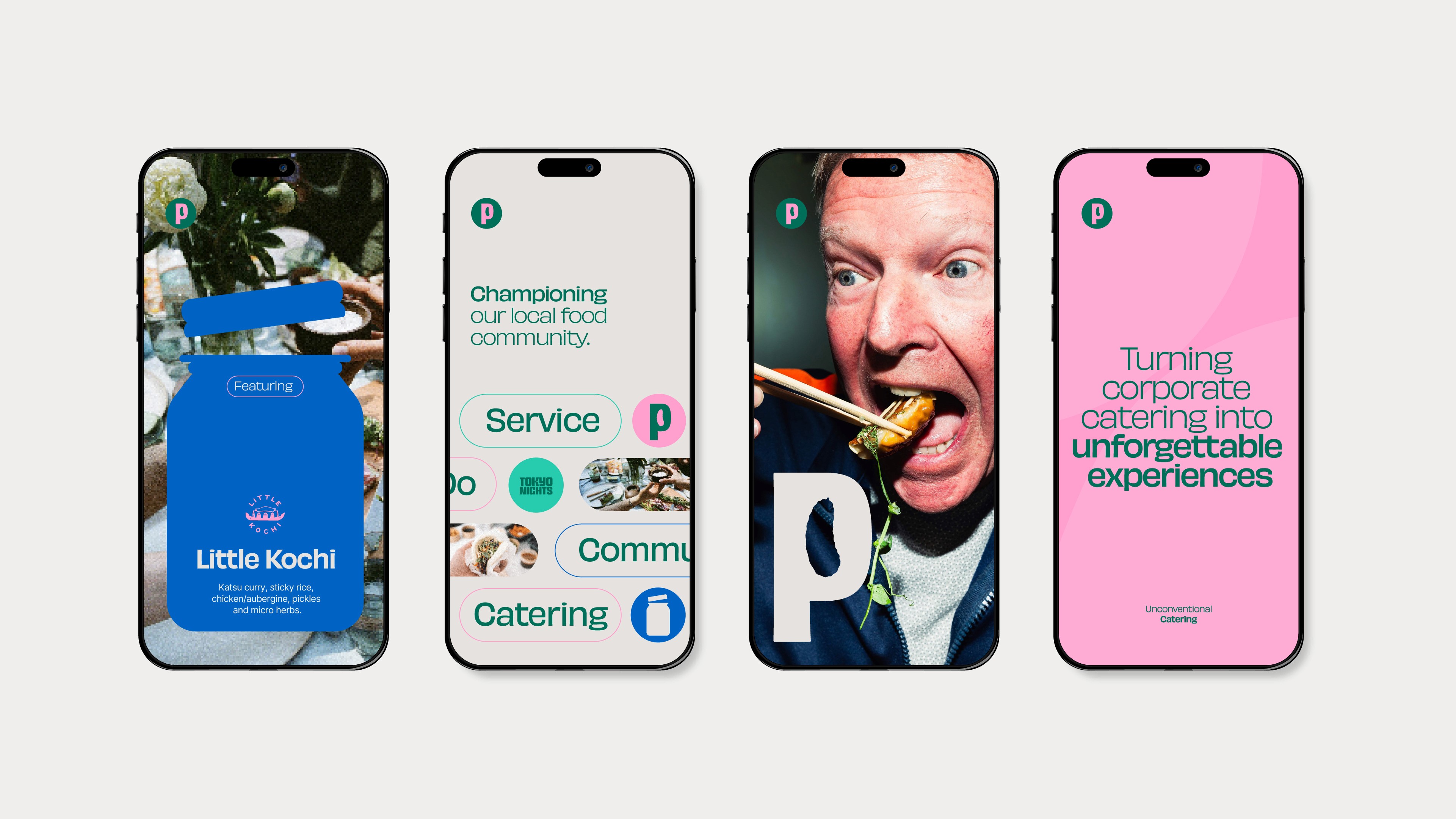
Pikkle
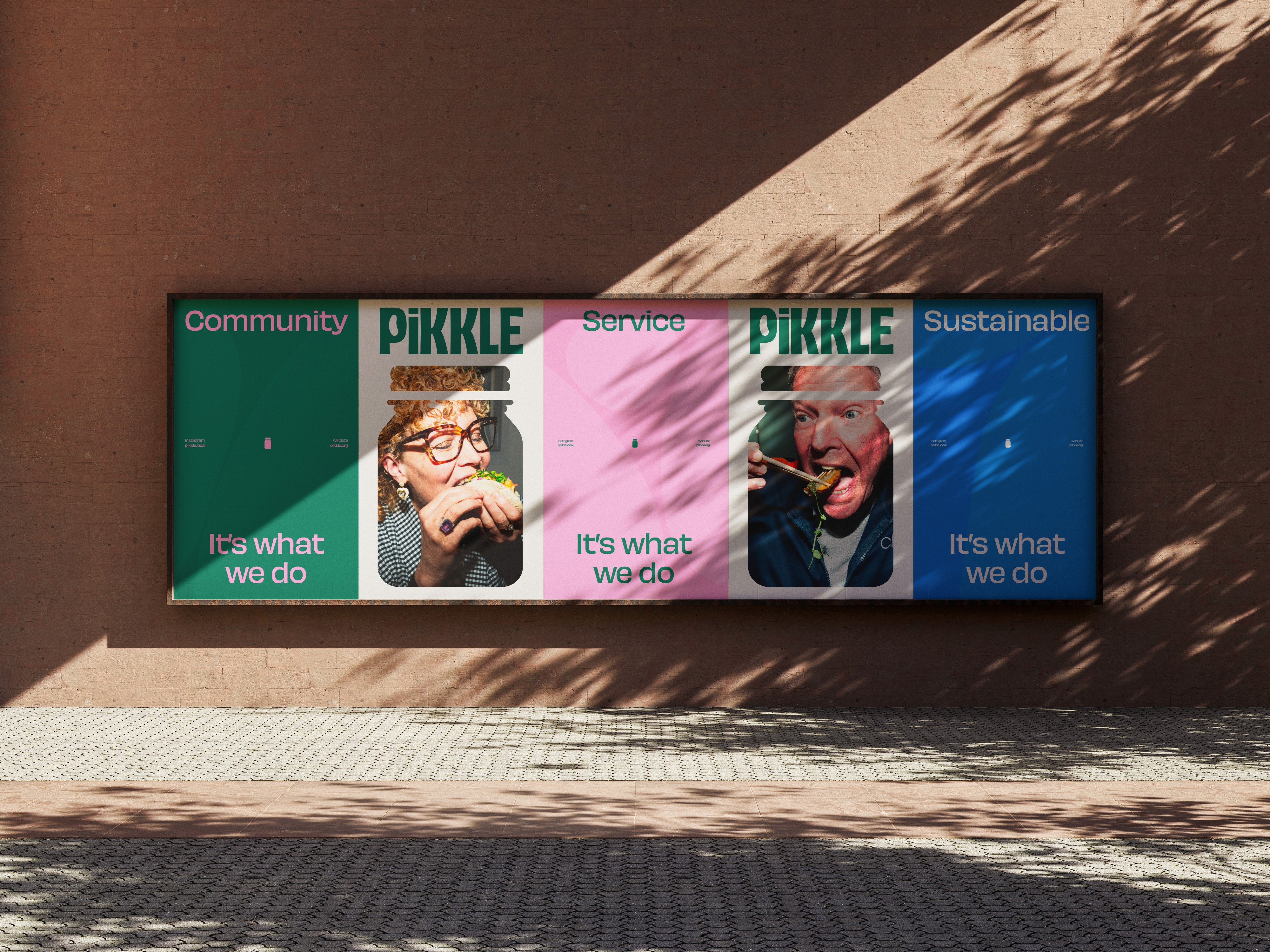
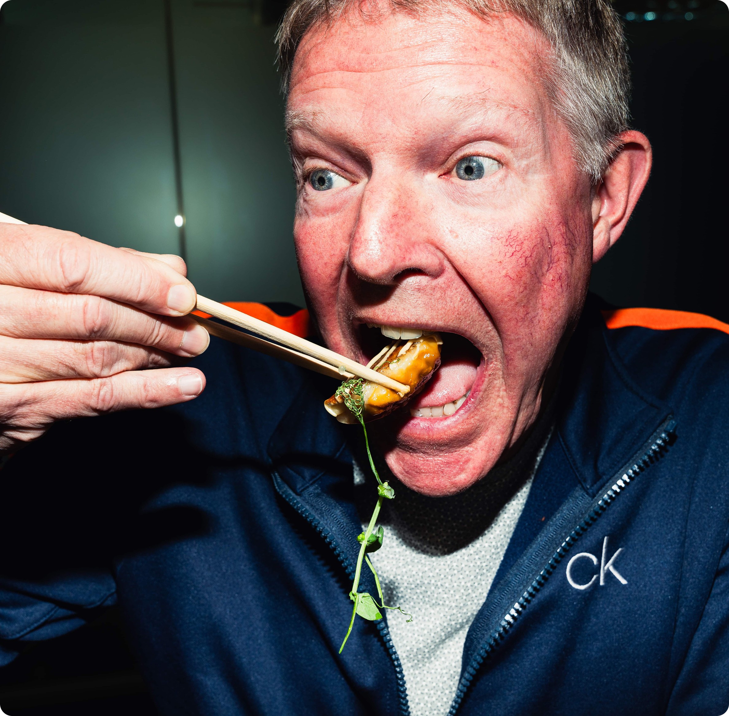
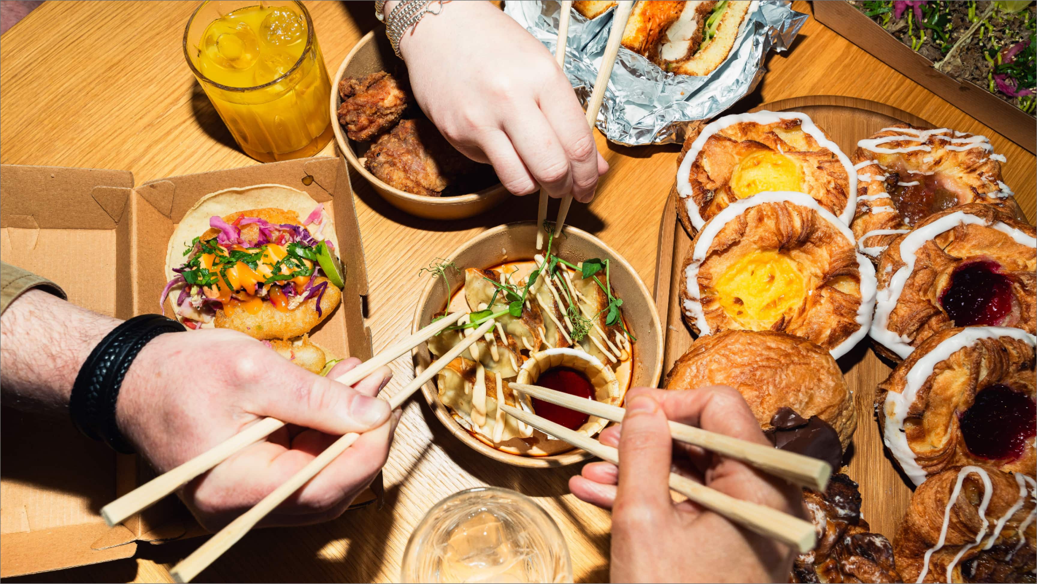
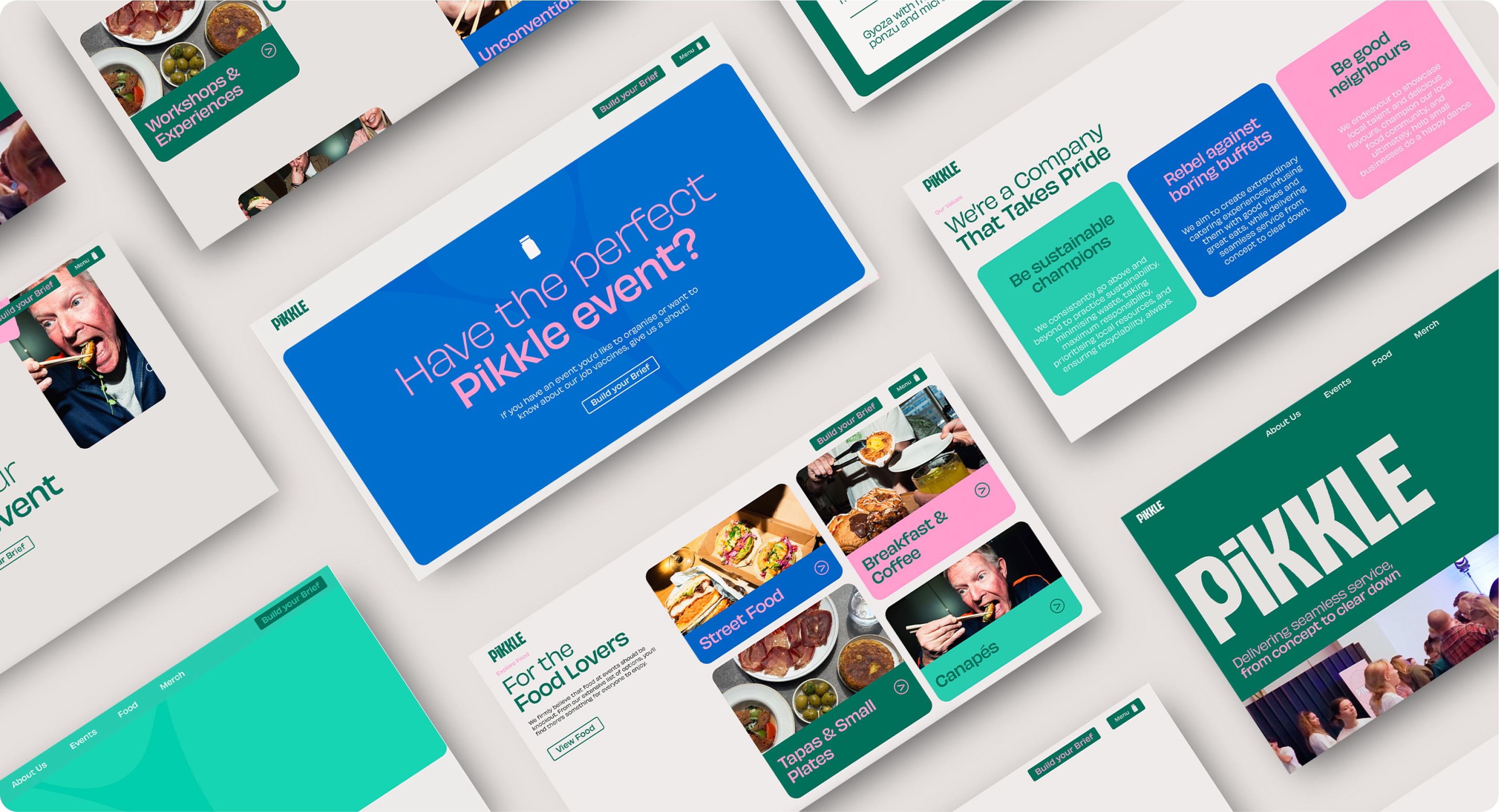
Pikkle are an events catering business with an unconventional twist, promoting and serving local, community street food at events they host. The challenge with Pikkle was to deliver a refreshed brand and website that still felt unmistakably like “Pikkle.” Refreshing a brand often hinges on knowing what to preserve. The core elements, what customers recognise and love, remain essential. In Pikkle’s case, that included the quirky pickle character, the iconic jar, and the signature pink and green colour palette. A brand refresh doesn’t need to be a total reinvention. By retaining familiar elements such as key colours and recognizable shapes (with a gentle update), and pairing them with modernised fonts and a simplified design, the result was a revitalised look that remained true to the original spirit customers already connected with.
Completion Date
2024
Category
Brand, Motion, Website
Sector
Catering & Events
The visual identity
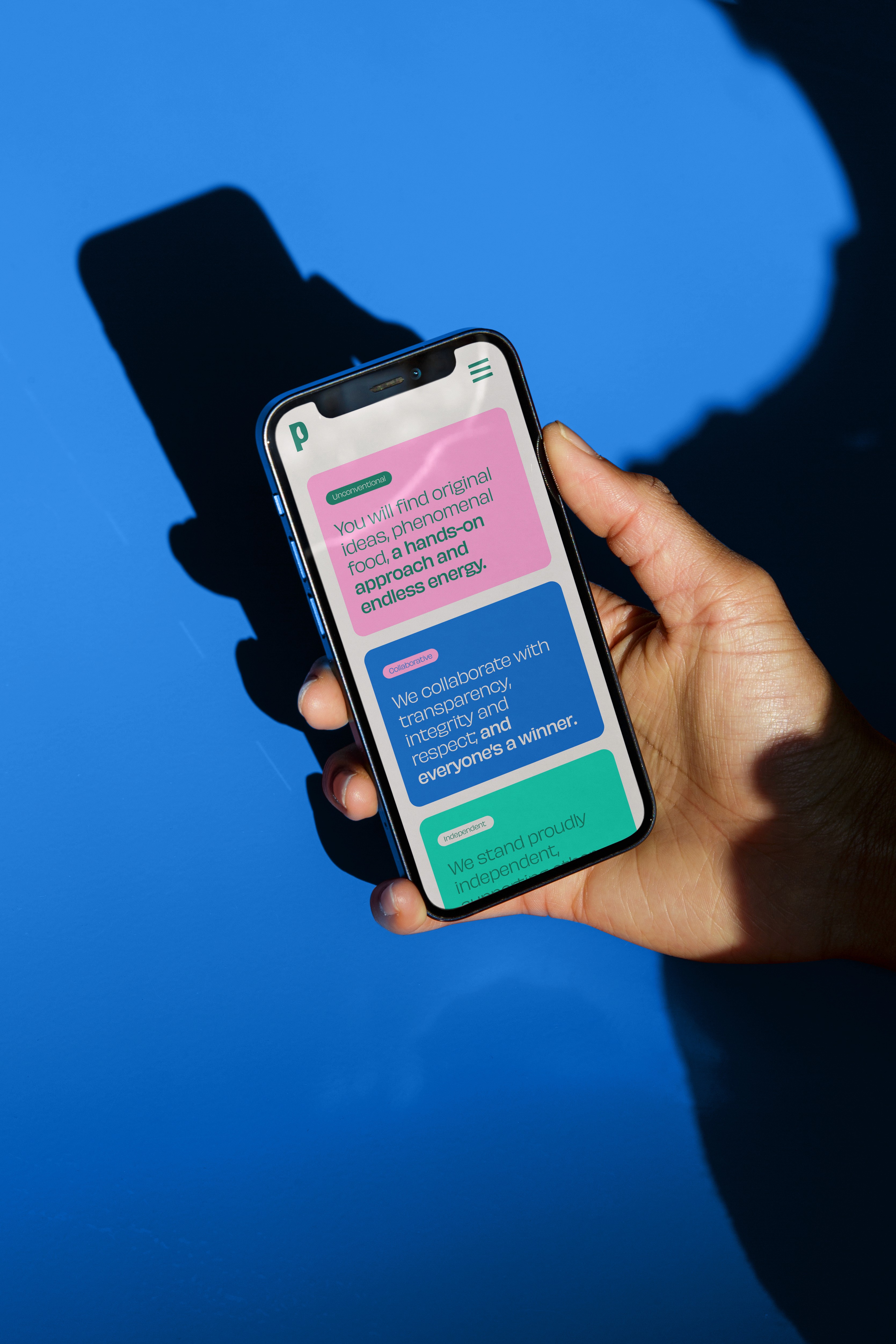
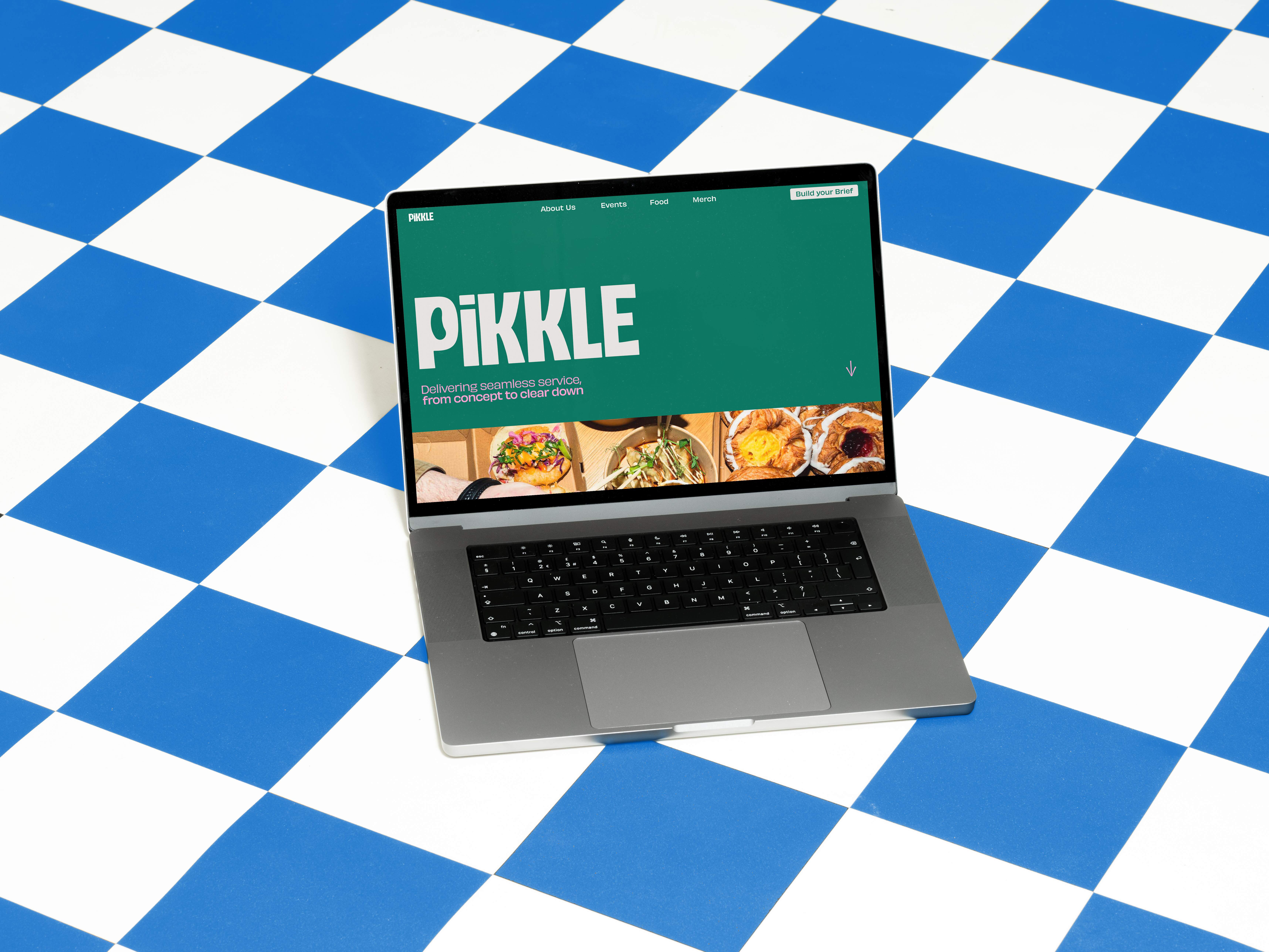
A strong, uppercase logo type lends the brand a sense of authority, while subtle quirks like the lowercase 'i' and curved letterforms reflect its unconventional business model, adding a touch of creativity and uniqueness. The brand centers on a strong and confident identity that sets it apart from the rest of the sector. Through the use of a bold logo and striking colours, it establishes itself as a distinctive outlier, commanding attention and redefining the industry standard. Striking colours and bold typography make the brand stand out, while dynamic shapes and graphics infuse it with a fresh, contemporary edge.
The brand system
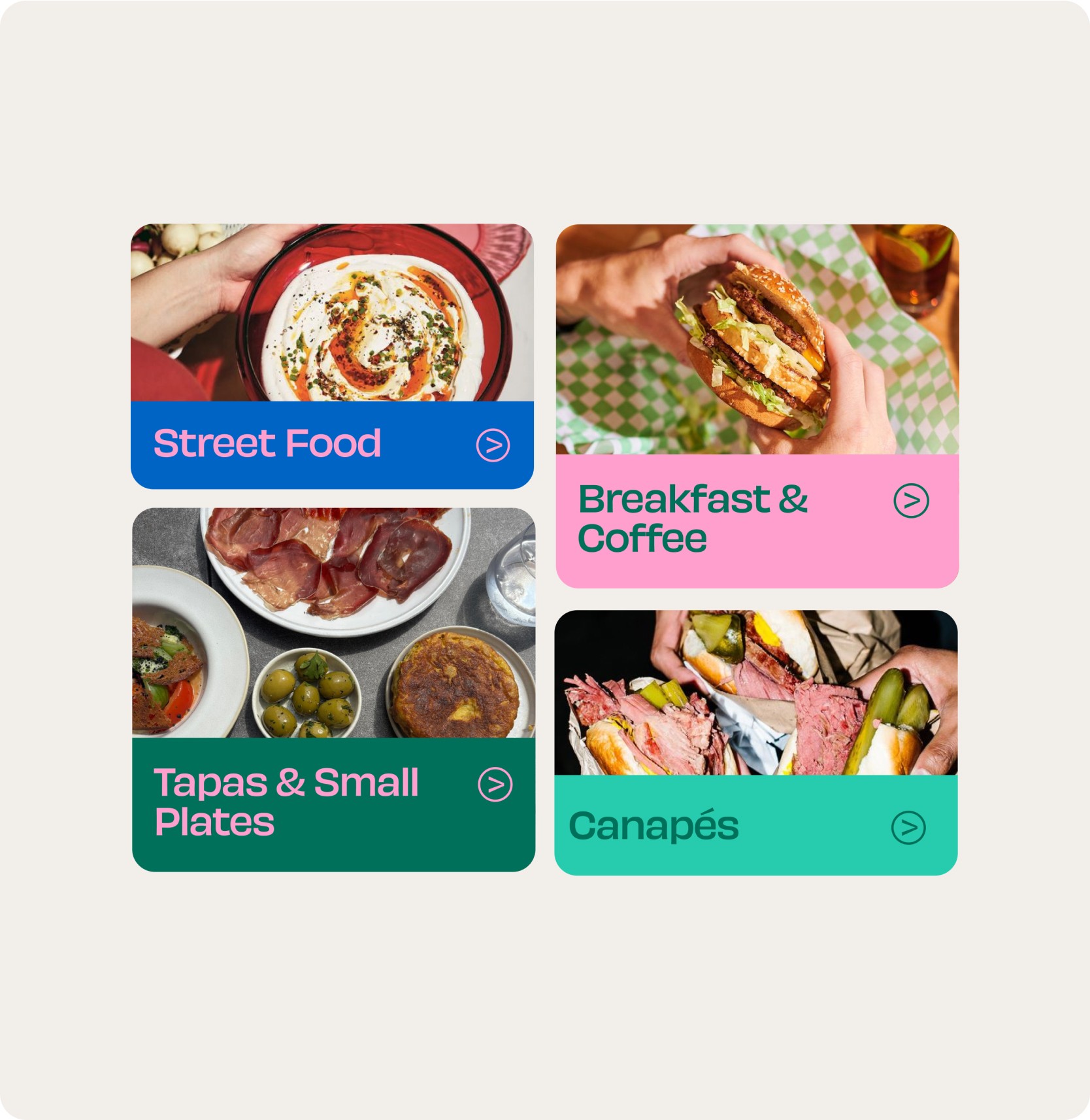
Championing the local street food vendors partnered with Pikkle is a key aspect of the brand identity, highlighting the importance of these collaborations and showcasing the value of their partnerships through the brand system. The pickle jars had become a beloved element of the brand’s original identity, personal to founders Hamish and Louis, so it was essential to preserve their presence in the final design. Rather than treating them as purely decorative, we reimagined them as functional components within the visual system. Whether used to convey key information, frame imagery, or highlight standout food vendors, the jars evolved into versatile design devices. Enhanced by subtle animations, adding a sense of motion and playfulness that brought the overall identity to life.
Deliverables
Brand & visual identity refresh, Brand Strategy
Credits
Designdough