Cradocs Crackers
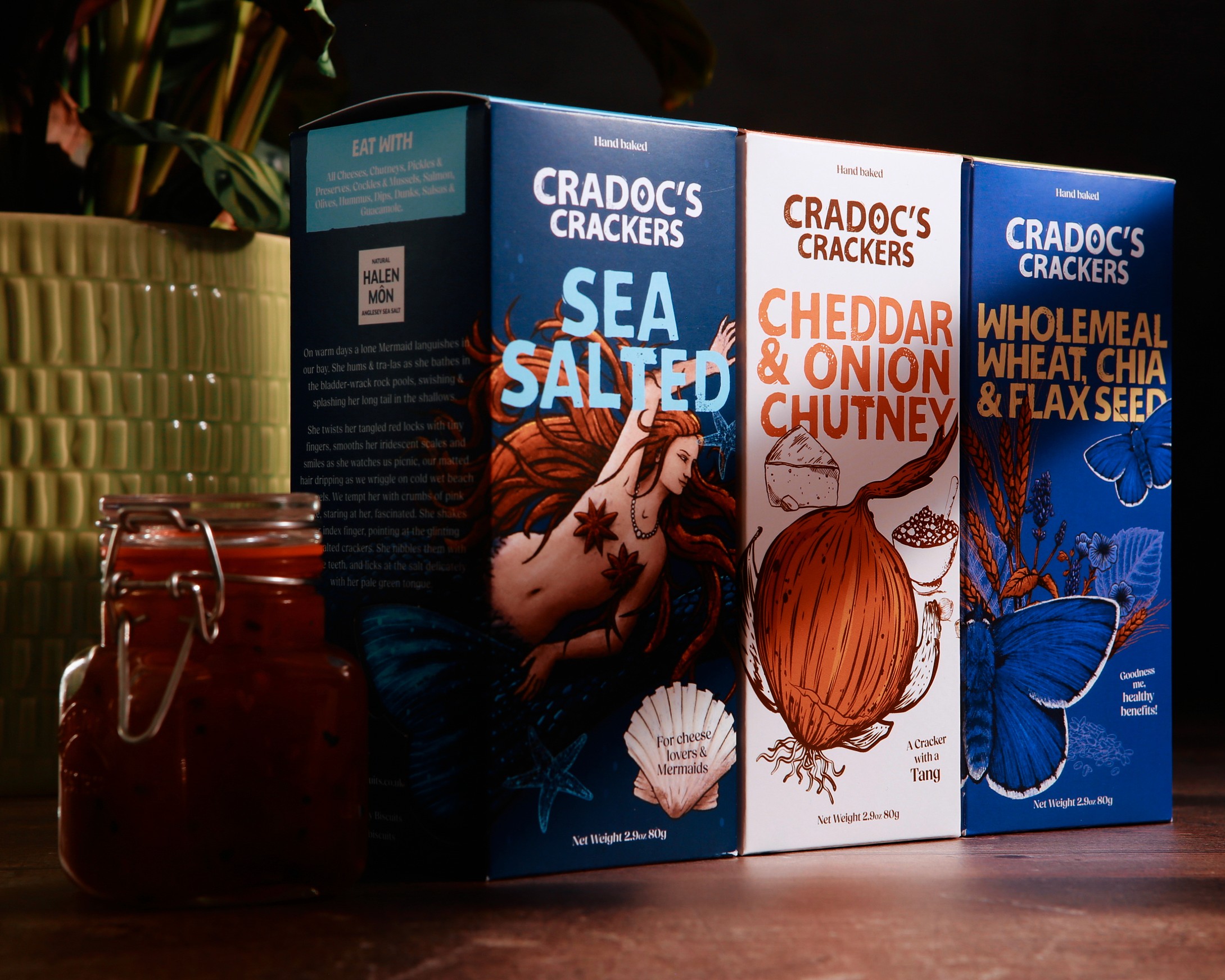
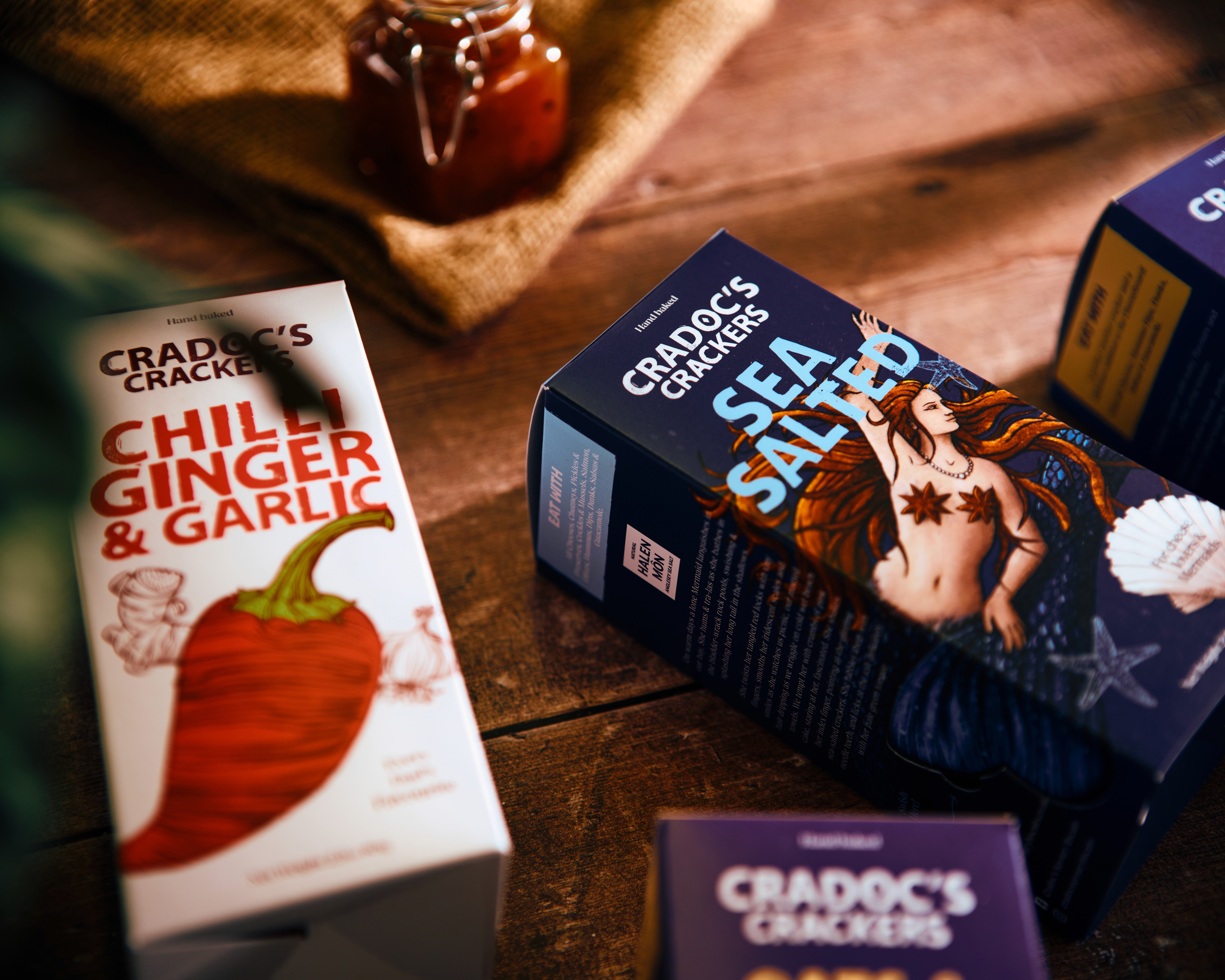
Cradocs Crackers were expanding fast, with a growing product range that needed a cohesive and instantly recognisable packaging system to support it. The original designs lacked consistency. Each box looked like a standalone product, making it difficult to identify them as part of a unified brand. Collaborating with Consumer Insights Lab, in-depth market and user research was conducted to identify key visual hotspots on the packaging and establish a clear hierarchy of information. The outcome is a distinctive, flexible packaging system that brings consistency across the range while allowing for clear differentiation between product lines. Each box now feels part of the same Cradocs family, making the brand more recognisable, shelf-presentable, and market-ready as a strong, unified suite.
Completion Date
2023
Category
Packaging Design
Sector
Food & Drink
Design & visual identity
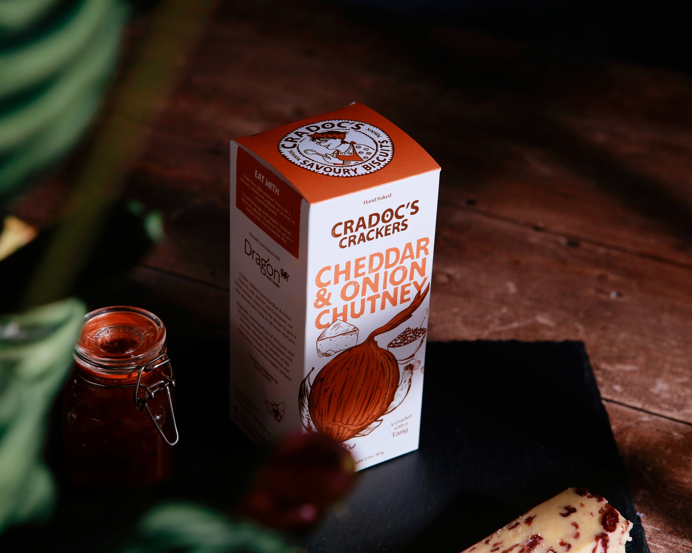
Cradocs is an artisanal brand known for its refined, premium feel, always with a touch of quirk to set it apart. Research revealed that illustration and colour were the strongest drivers of shelf appeal, followed by flavour cues and product information. With that in mind, a bold new visual language was developed, introducing a fresh suite of illustrations, vibrant colour palettes, and expressive typographic elements. Each element was carefully crafted and composed to maximise visibility and recognition, while maintaining a clear hierarchy to guide the customer through the information that matters most.
Deliverables
Packaging Design Update
Credits
Designdough, Consumer Insights Lab