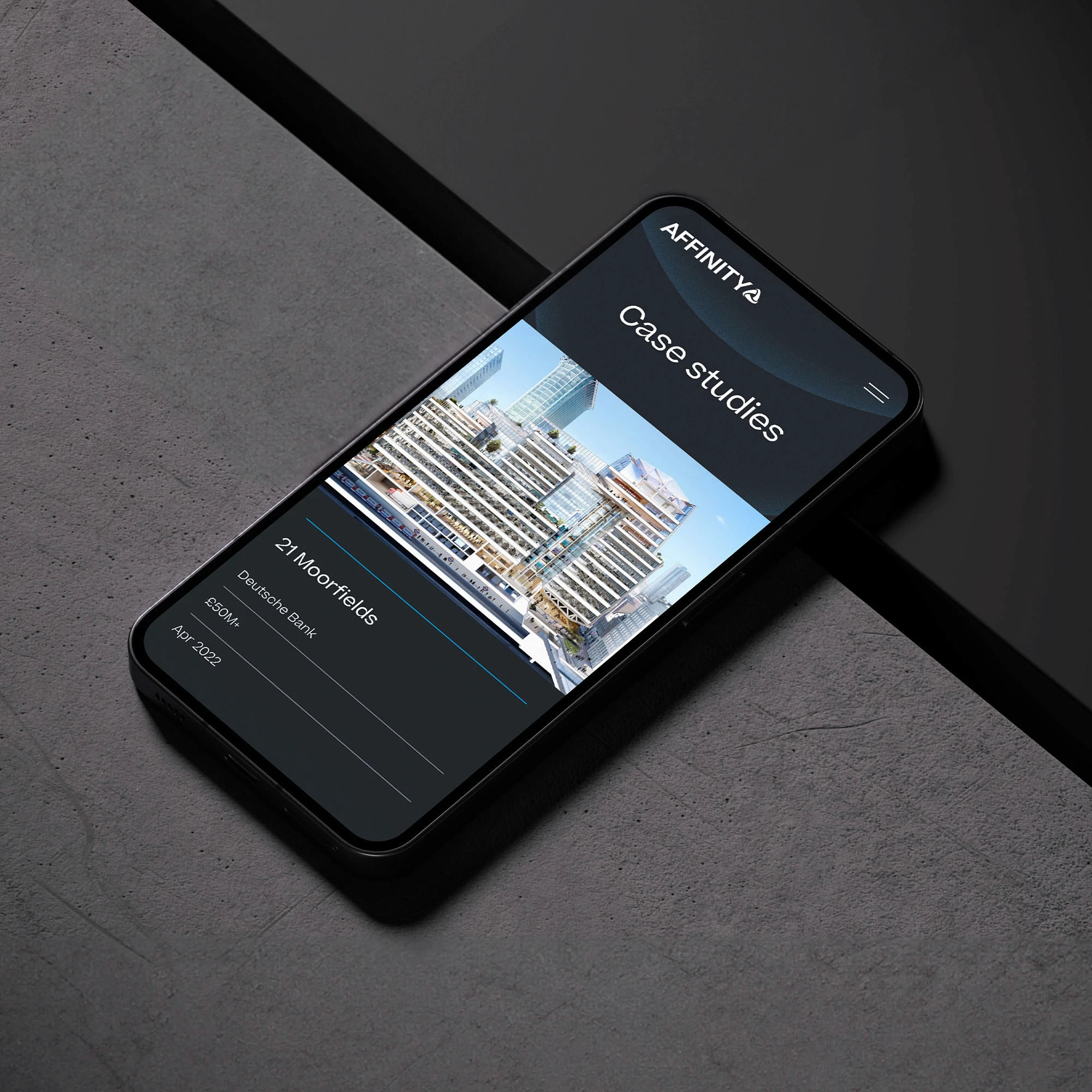
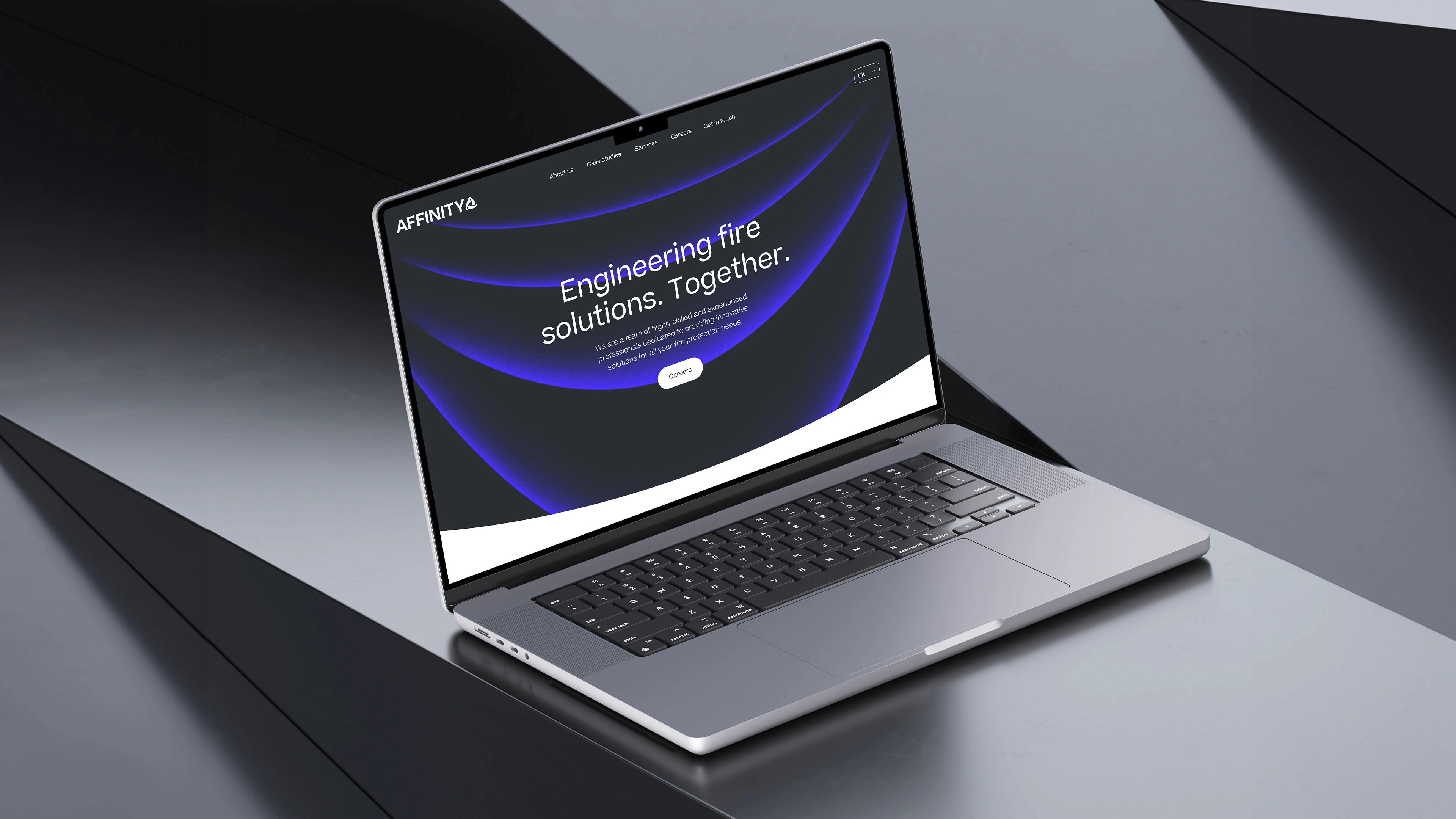
Affinity
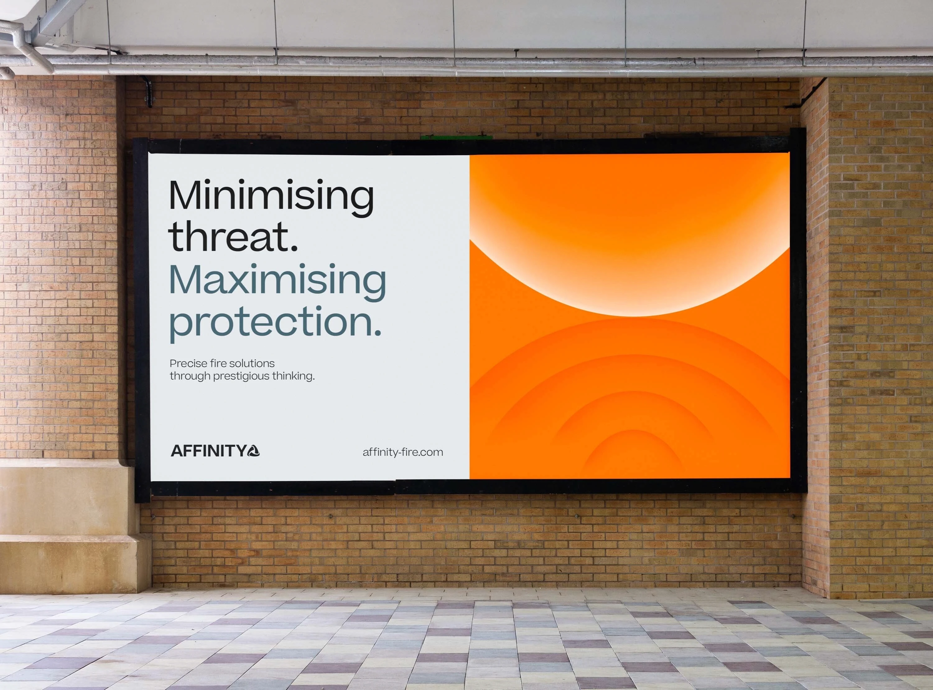
An new and energised brand which looks to bring Affinity to the forefront of fire engineering in the UK in terms of presence, while also adding new meaning to the name ‘Affinity’ using a brand system based around magnetism and it’s accompanying forces. A brand idea based on their name. The idea grew from the meaning of 'Affinity', a natural liking for and understanding of someone or something. This formed a design system inspired by the magnetic forces of attract and repel. The idea of pushing, protecting buildings through great engineering and pulling, attracting talent and expertise to get the job done. Using angular brand textures inspired by the arcs of their logo which were used to communicate the brand.
Completion Date
2023
Category
Brand, Website
Sector
Heavy Industry
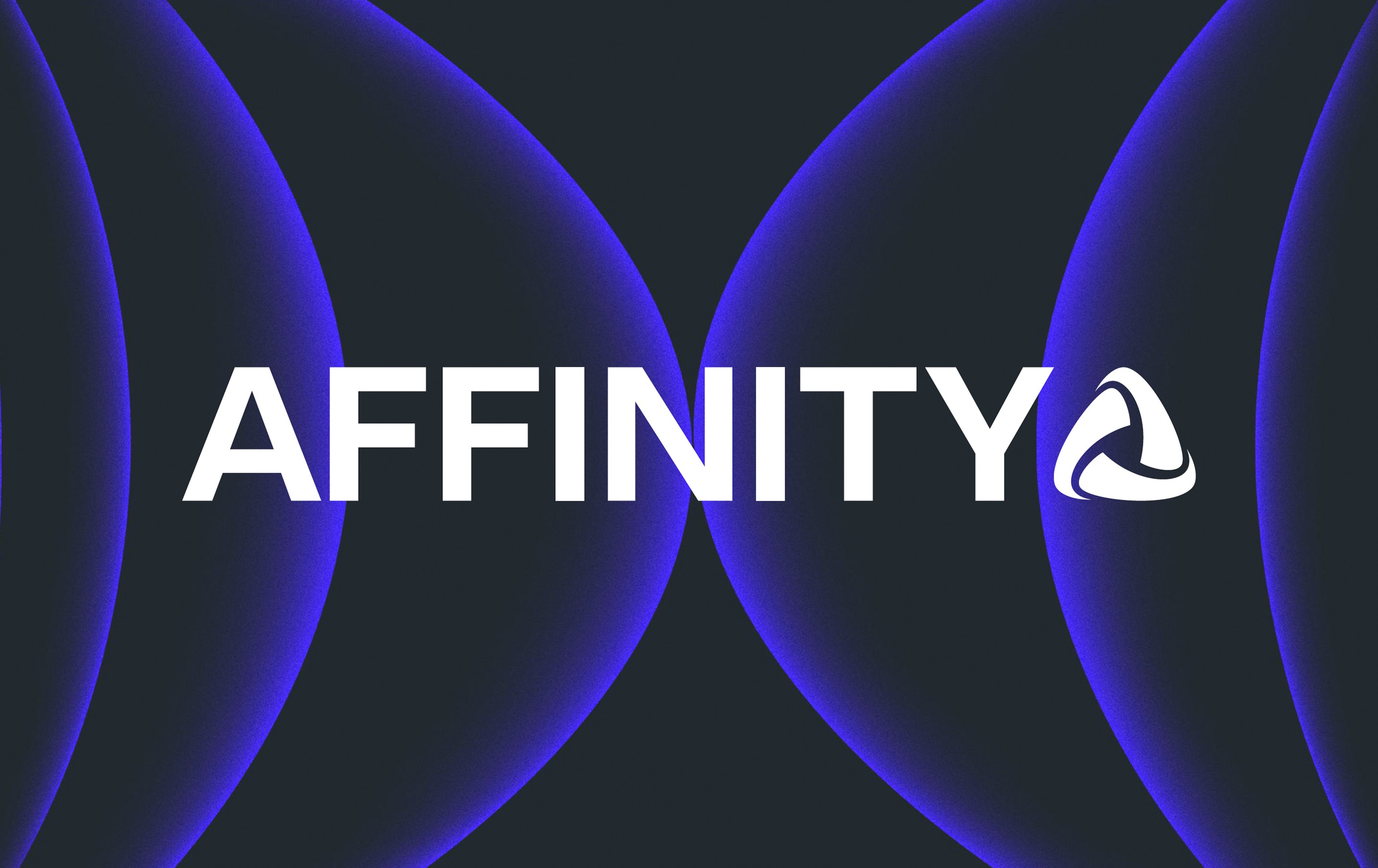
A new look
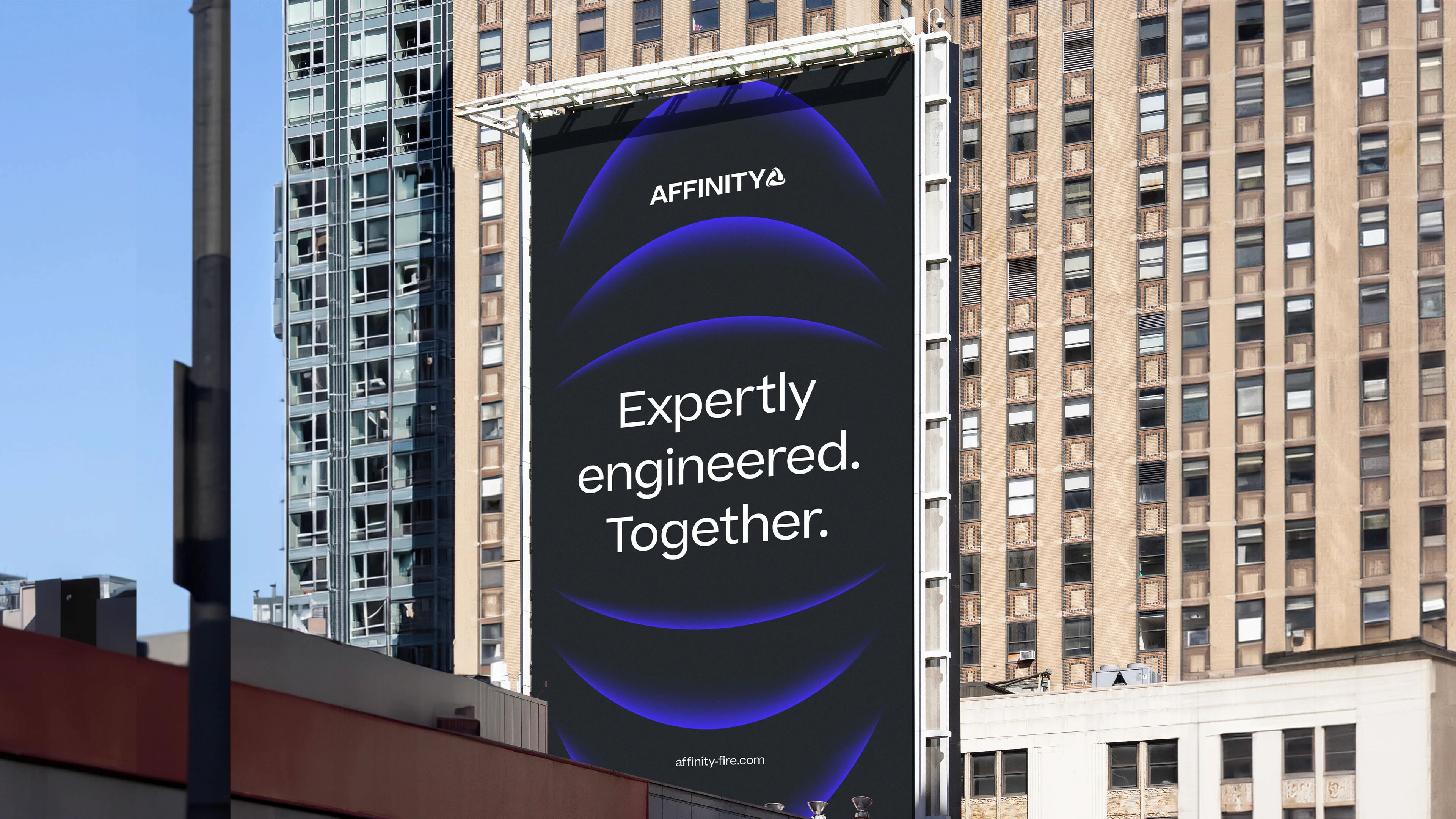
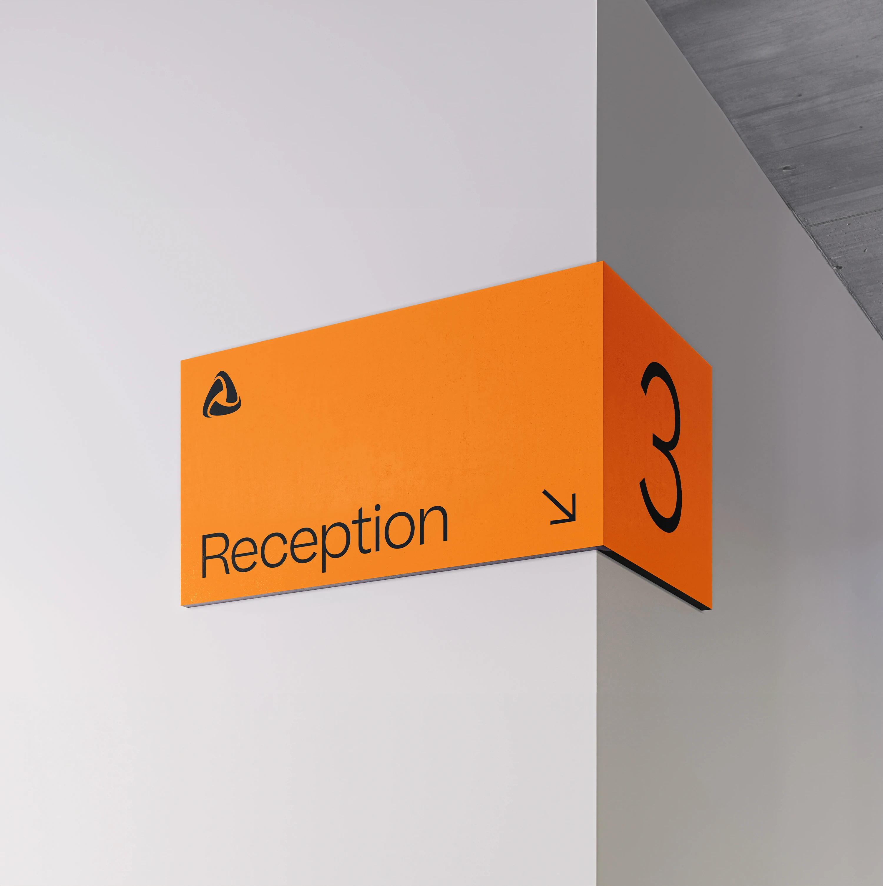
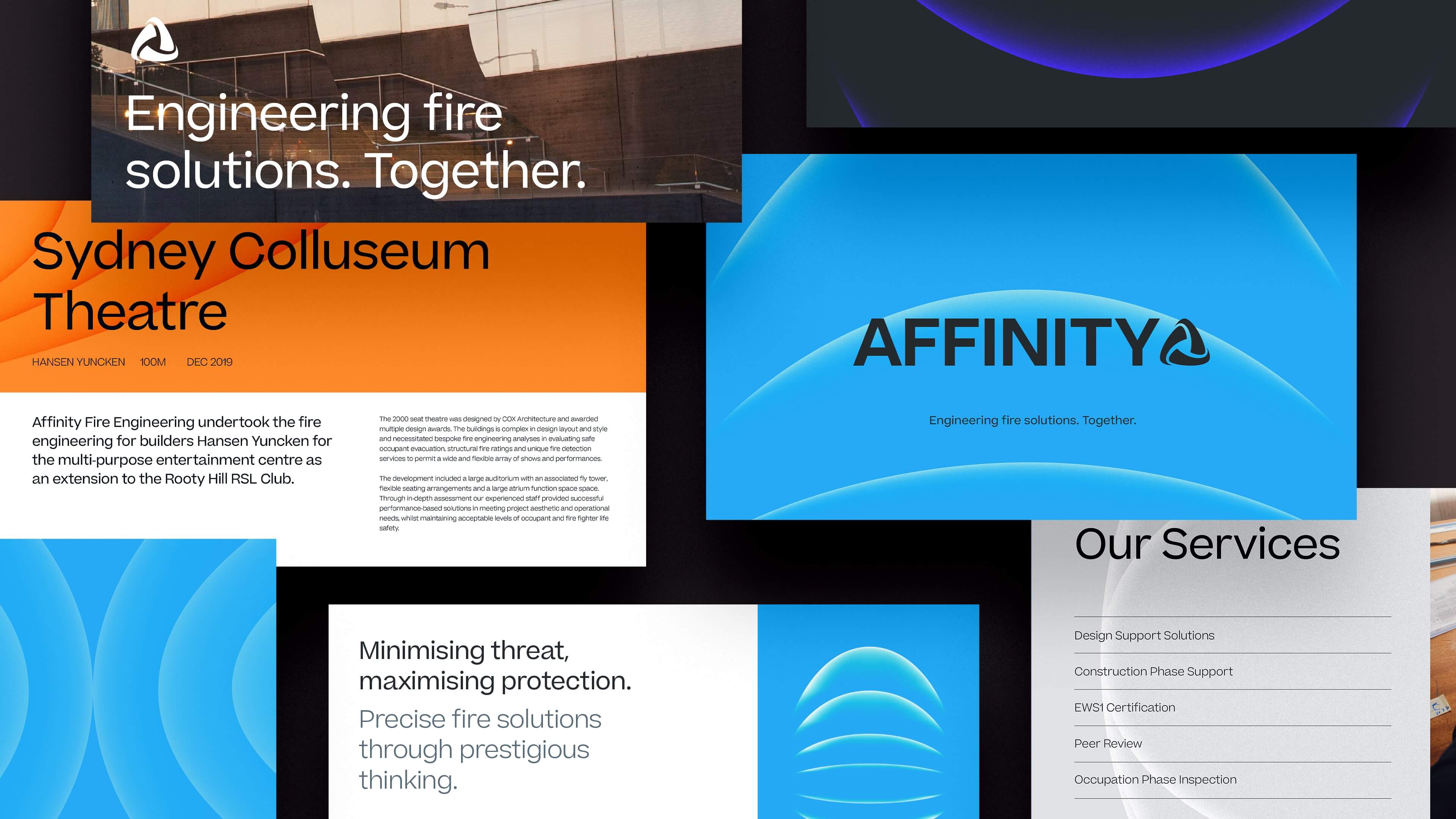
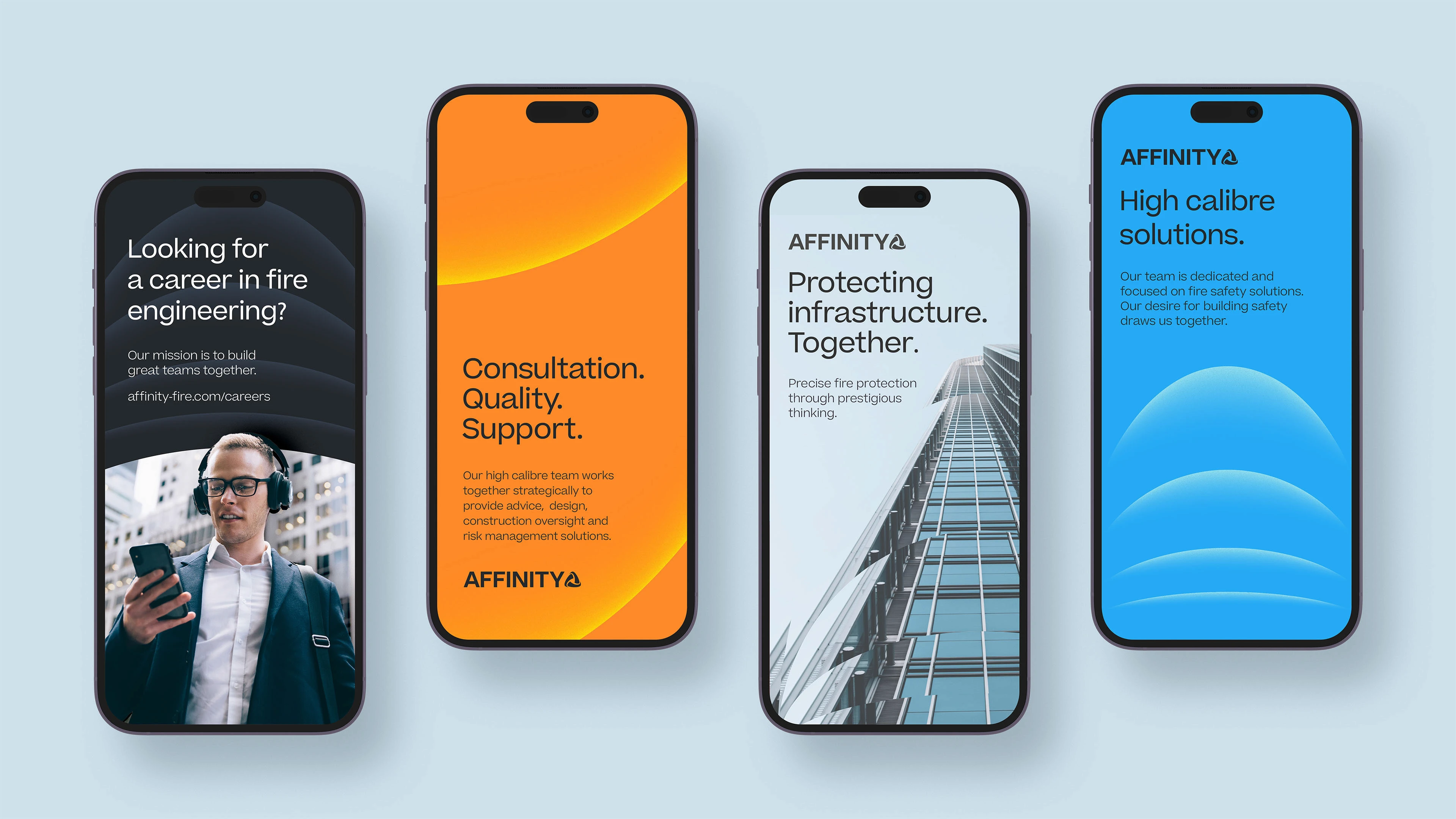
Affinity needed a re-haul, their previous identity lacked versatility, flexibility and didn't frame them as the experts they are. So the logo was re-drawn based on the original, and their palette was refined to give them a clean, cutting edge look.
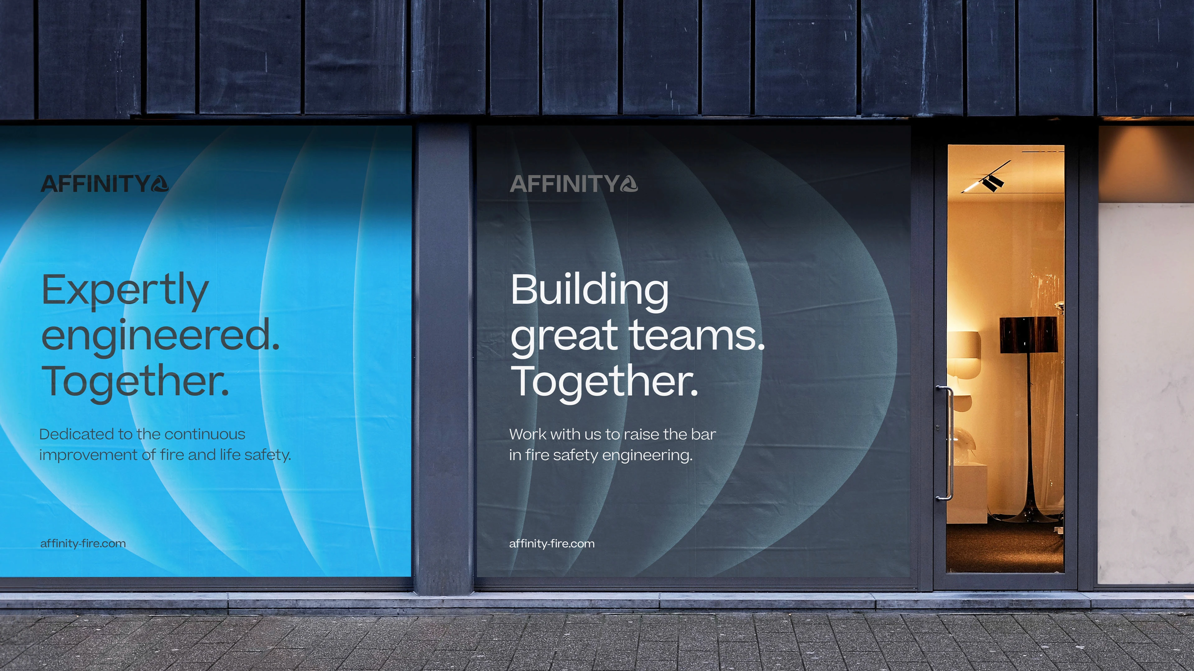
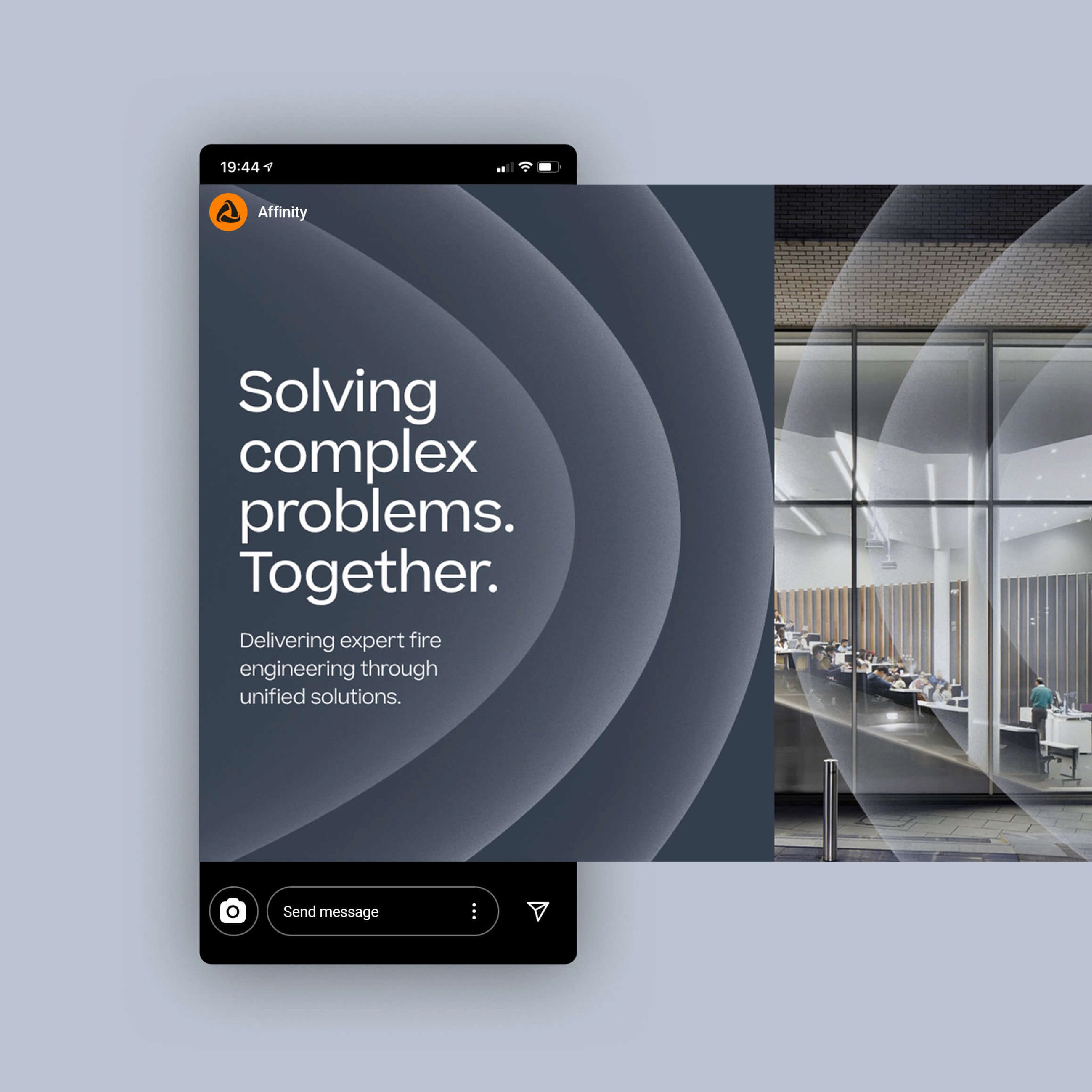
New, on brand messaging
New, updated brand messaging that fused together the idea of togetherness, creating brand statements that are adaptable to their services and audience needs. Reinforcing the idea of affinity. Together, the refined brand helped transform Affinity into a leading force in the fire engineering sector. Using clean layouts and utlising the bold, punchy brand imagery helped elevate the Affinity brand through print and digital media.
Deliverables
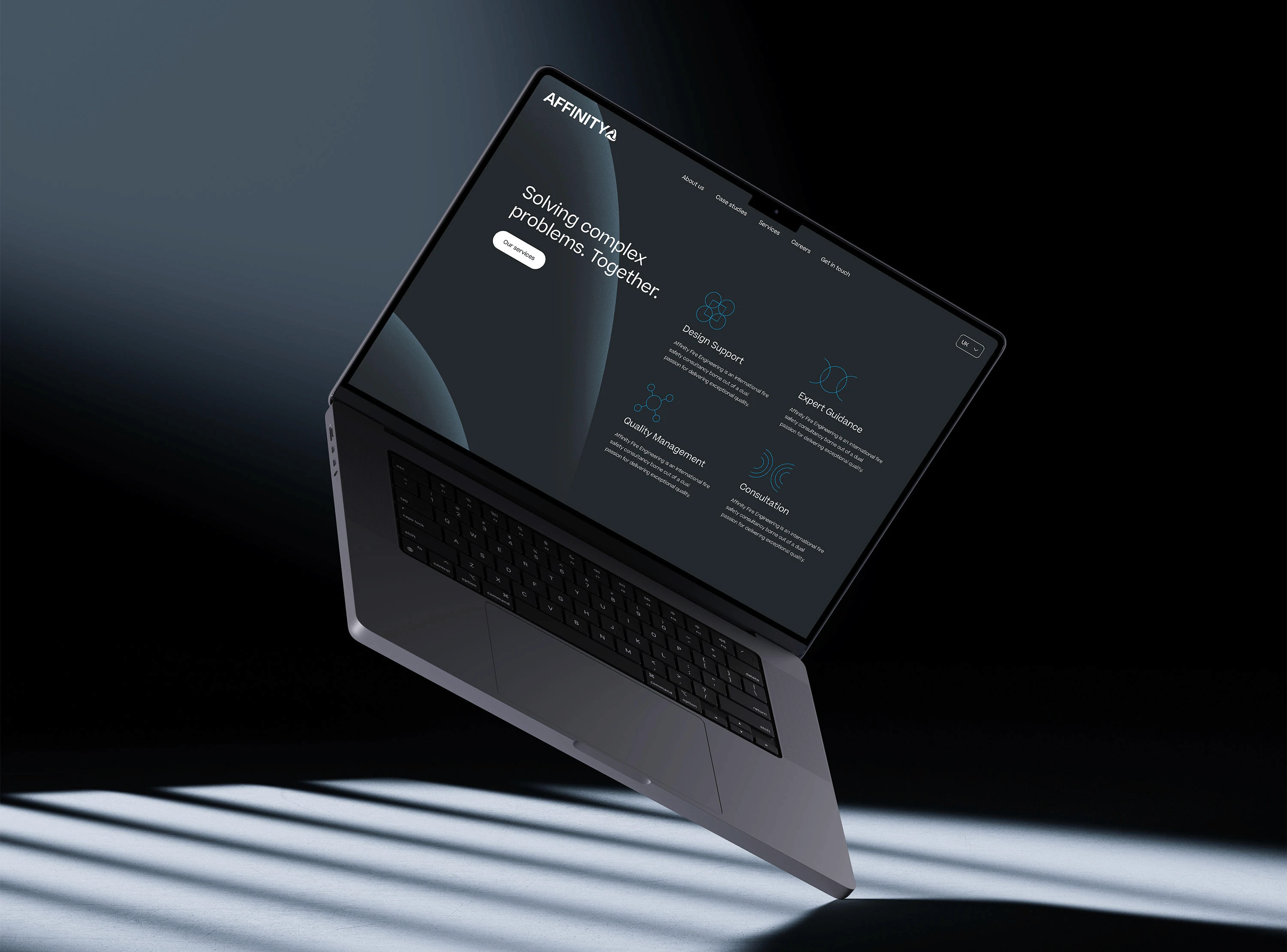
Brand & Visual identity refresh, redesigned responsive website
Credits
Toward Studio